Interactive Media & Marketing
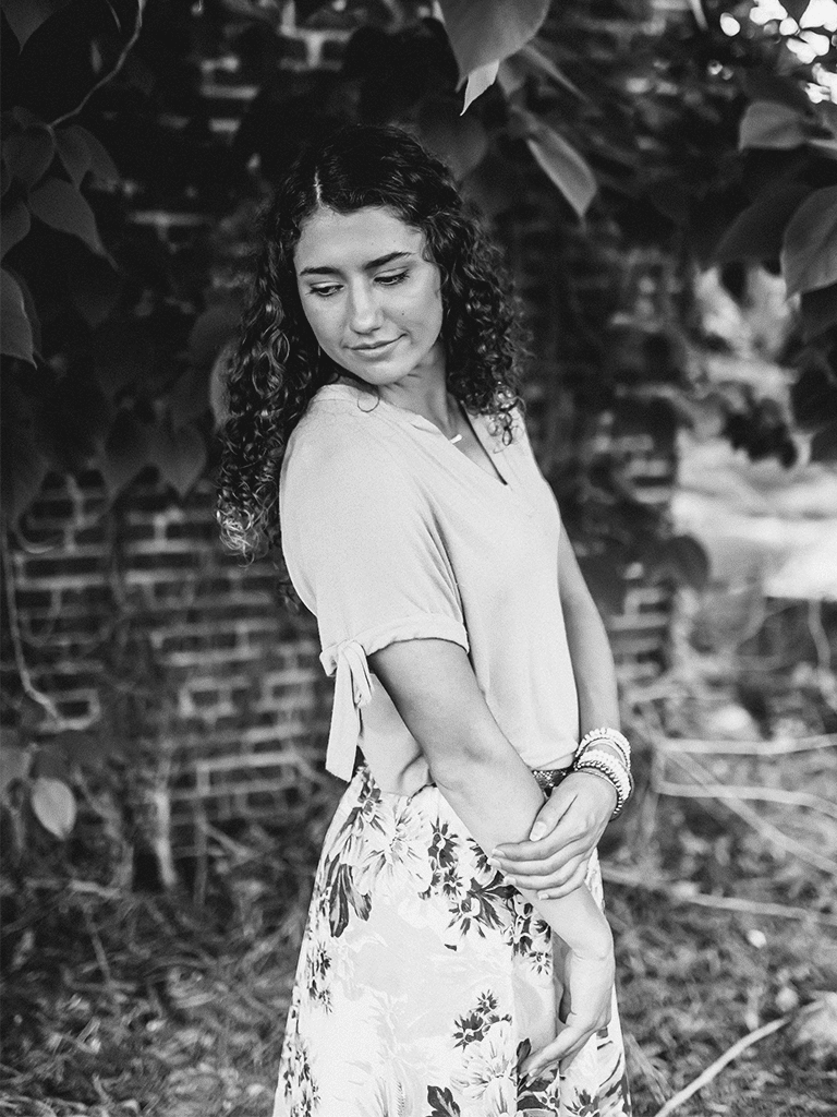
Artist Biography: Carley Hale was born in El Dorado, Arkansas and has lived in Iowa, Tennessee, and Texas. She is currently finishing her Bachelors of Fine Art in Interactive Media & Marketing at Southern Arkansas University. Being a part of the yearbook team throughout high school awakened Carley’s love for layout design. Yet, the lessons and experiences she learned while moving hometowns during her childhood molded her approach to design. She says relocating and creating art carry the same process, as both begin with a blank canvas, have uncomfortable challenges, and ask the person/artist to decide between tradition or change in response to these challenges. It is through these growing experiences that she has found a passion in creating art.
The main theme and approach for Carley’s work centers around the commercial and advertising media. Her style is contemporary with many of her designs carrying hidden and abstract elements (color, imagery, typography, design, etc.) about the businesses or events she is designing for. Through these hidden elements, her goal is to show the full identity of the business, organization, and event.
Carley has done professional work for small businesses while attending college. She desires for people to see a business in its environment and believes the best way for people to truly witness that is through graphic design. Her technique is adaptable and always changing based on the client’s style and project necessities. She constantly strives for each design piece to have its own unique style in color, layout, type, etc., making her artwork impressively stand out among the competition.
Carley's Work
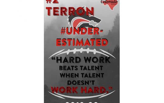
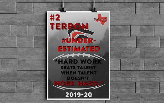
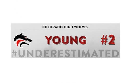
Colorado City High School Football Posters:
In Summer of 2019, posters were needed for the Colorado City High School Football team’s locker room. My role was to create a two-piece poster set with each player’s first name on the big poster and their last name on the smaller one. The poster were created in Illustrator. The colors I chose were based on the school colors of the high school: red, black and white. Because the school’s mascot was a wolf, I decided to make the background of the poster like woods where wolves live. My desire was to play with the theme and environment wolves live in while also using color and graphic elements to support the school.
Harry Potter Quote Poster:
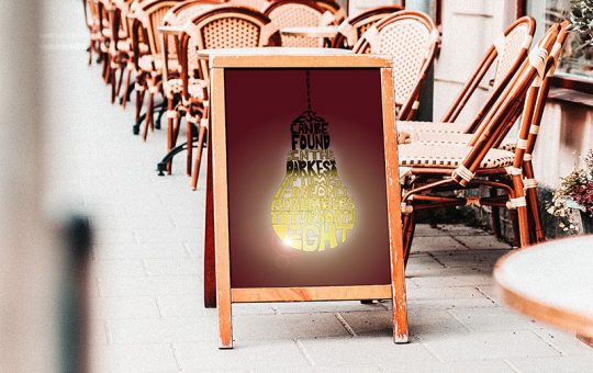
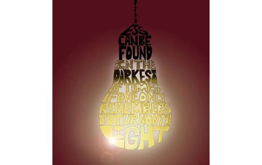
The challenge with this project was to create an image with text. The quote I chose was from Harry Potter when Dumbledore says, “Happiness can be found in the darkest of times if one only remembers to turn on the light.” Based on the quote and the emphasis of light, I chose to make a light bulb out of the text. The poster was created in Photoshop, and the colors, red and yellow that I chose were based on the Gryffindor House that Harry was in.
ISI Ministries Full Branding Campaign:
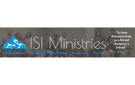
Summer of 2020, the ISI (Iron Sharpens Iron) Ministries pastors were needed a logo for their new college ministry starting Fall 2020 at Southern Arkansas University. I incorporated ISI in the mountain as the shadows (the blue color). This way people would see ISI even if the mountain was the only symbol used in certain advertisements and not the words “ISI Ministries”. Once the mountain was complete, I placed “ISI Ministries” centered below the mountain in poinet font.
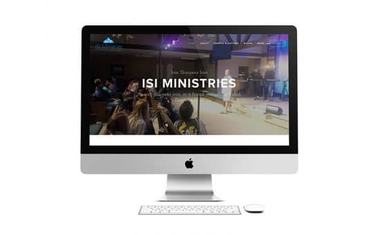
Closing summer of 2020, the pastors wanted an official website. My role was to design their website by putting in all their information in SquareSpace.
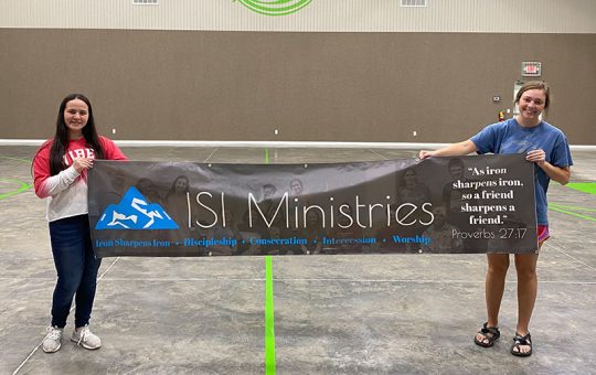
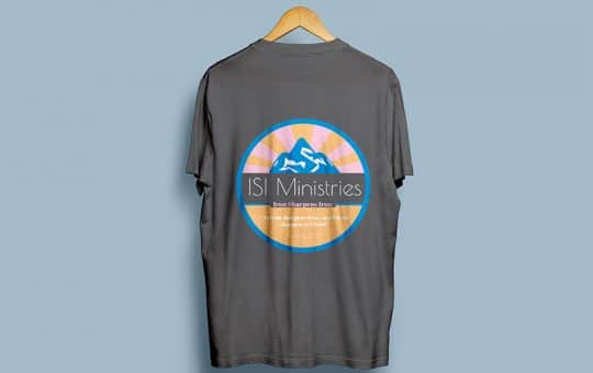
Fall 2020 I designed a banner for the ministry to hang when doing events on campus and a t-shirt for them to sell and give their students who regularly attended ISI.
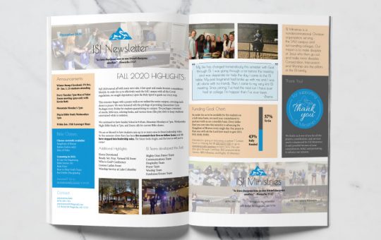
Finally, in Winter of 2020, the pastors wanted to send a newsletter to all of their supporters that donated to the ministry. I designed this piece in InDesign and had a lot of fun creating a two-page newsletter for them.
Mule Kick Branding:
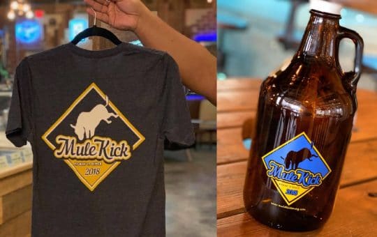
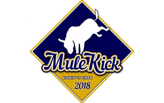
In 2018, the owners of Mule Kick were requesting a logo for their new business. My role, along with three other students, was to supply them with a logo option for them to choose from. Mine was one out of two selected to represent the business. This particular logo was to be used for the restaurants online and social media branding. Since the logo’s creation, it has also been placed on shirts, mugs, and even was made into a metal plaque.
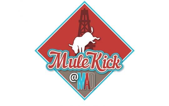
Winter 2021, the owners of Mule Kick wanted to edit the logo for an event planned with the Murphy Arts District. My role was to combined the Murphy Arts District colors, blue, red, and gray, and logo with the original Mule Kick one. I also designed this new logo in Illustrator.
Pasteles Branding:
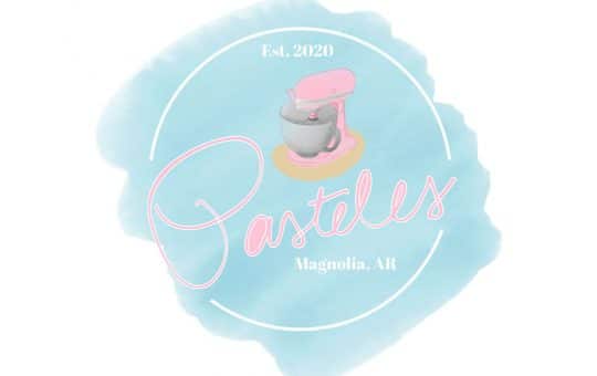
In Summer of 2020, a young High School graduate wanted a logo for a home-bakery business she was starting for herself. She expressed her need for an image and expectations for a branding theme. She also elaborated on color scheme (blue and pink), the trademark (a mixing kitchen aid), and the font of Pasteles (her own hand writing). Taking all these aspects into consideration, her bakery name “Pasteles” was then used as a pun (play on words) in creating the logo. Pastel blue and pink were used as the specific color codes. As a whole, the client was very pleased with the result.
Surfing in Arkansas Poster:
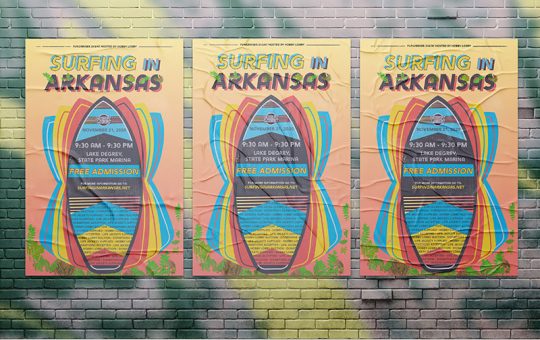
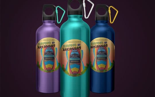
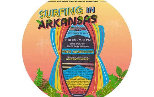
The task given was to create an event poster based on a fictional event called Surfing in Arkansas. I chose to make Arkansas black and red based on the University of Arkansas school color’s (red, black, and white). Because the event was being held in Arkansas, I also decided to include Arkansas’s most common tree leaves: the Oak, Hickory, Pine and Maple. As a whole the color scheme and design elements were based on the summer theme and the boards people use to wake-surf at the lake.
Tokai Carbon CB Newsletters:
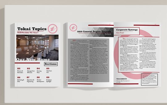
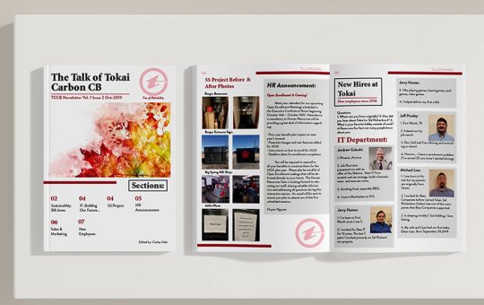
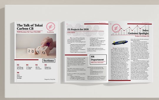
Summer of 2019, I interned at Tokai Carbon CB. The corporate office was wanting a newsletter to be sent via email to the employees of the company. My task for the summer was to create a online, multi-page newsletter.
At the end of the Summer, the CEO of Tokai loved the newsletter so much that he hired me part-time to continue designing a quarterly newsletter for the company remotely. I then designed two more: one in October of 2019 and another in February of 2020.
